Faceless YouTube Thumbnail Tips to Boost CTR

By Alex David Du · Updated
Alex writes about gaming, tech, and simple online income ideas, and builds projects that bring ideas to life.
Clicks start with the thumbnail. If the packaging is weak, the best video sits unseen. This guide keeps it simple, so a faceless channel can get more clicks without gimmicks or guesswork.
Here is the short version. Thumbnails win when the idea is clear at phone size, the title and image work together, and you test small changes instead of guessing. If the basics are not set yet, here is a simple faceless YouTube tools and workflow to get the stack in place.
CTR on YouTube, what it measures
CTR, or impressions click through rate, shows how often someone clicked to watch after YouTube showed the thumbnail and title as an impression. It is not all views, only those counted as impressions on YouTube surfaces. That is why CTR looks different from total view counts.
Key notes:
-
There is no single “good” CTR for all videos.
-
Compare new uploads to your own past uploads.
-
Watch how CTR shifts over time, early spikes are normal as the video is shown to a small, very relevant audience first.
Traffic sources, why CTR varies
CTR changes based on where the impression came from.
-
Home and Browse usually show lower CTR, reach is wide, interest is mixed.
-
Search can have higher CTR when the thumbnail and title match the query.
-
Suggested sits in the middle, the right neighbor videos help a lot.
-
Channel page and notifications often look higher, this is your warmest audience.
Judge CTR inside each source, not all lumped together.
Thumbnail specs that stay sharp
Start with clean files so compression does not ruin the image later.
-
Size, 1280 by 720, 16:9 ratio.
-
Format, JPG or PNG. If JPG looks fuzzy, try PNG.
-
File size, under 2 MB.
-
Do not upscale small images to fit 1280 by 720, they will look soft.
-
Export at high quality, then check the upload result on a phone.
Faceless Friendly Design Patterns
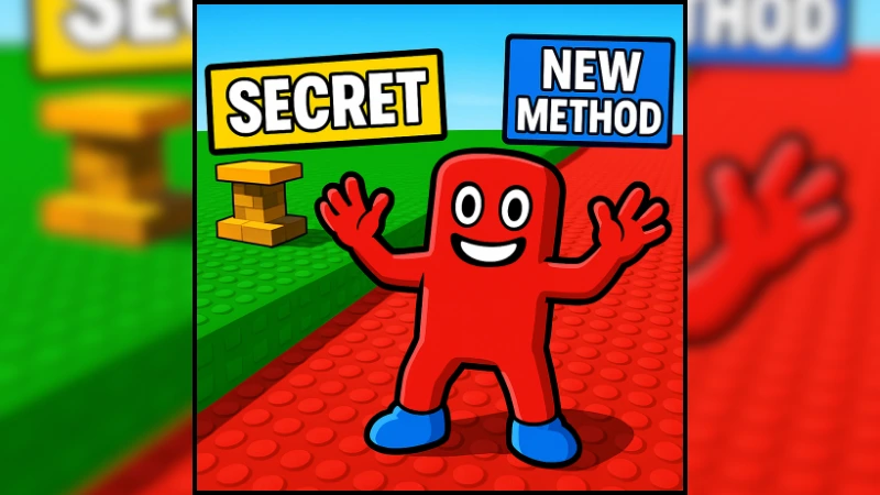
These patterns show up again and again in wins shared by creators. The example below ties these ideas together so the flow into the next section is clear.
One focal subject
Pick one big subject in the frame. Lose tiny details. At phone size, small elements turn to mush.
High contrast
Use bold color and strong light and dark separation. Do a quick grayscale check, if it reads in gray, it will read in color.
Ultra short text
Use one to four words, big and readable. The image carries the story. The title does the heavy lifting for context.
Curiosity without tricking
Give a hint, not the whole answer. A clear question or reveal beats loud stickers or arrows.
Template, then iterate
Keep a recognizable style so people spot your videos fast. Rotate layouts so the feed does not feel samey.
Example Thumbnail Breakdown

What works here
-
One dominant subject placed center-right so it reads in one second.
-
High contrast primary colors and thick outlines that survive mobile size.
-
Two ultra-short labels, SECRET and NEW METHOD, instead of a sentence.
-
Clear left–right story, scene on the left, payoff on the right.
How to adapt for faceless videos
-
Use a bold object or channel mascot instead of a person.
-
Keep the big-subject vs scene split, and let color contrast carry the click.
-
Limit on-image text to one to four words.
-
Prepare two or three small variants, then run Test & Compare.
Now pair the example layout with a short title that completes the idea without repeating the on-image words.
Pair The Title And The Thumbnail
Think of them as one sentence split in two parts.
-
If the title says the topic, the thumbnail shows the outcome, the reveal, or the emotional beat.
-
If the thumbnail is very specific, the title can be the clean, plain explanation.
-
Avoid repeating the same words in both. Let each part add something new.
Quick title helpers
-
Put the payoff up front, then detail.
-
Use numbers only when they help the promise, not to decorate.
-
Avoid long, heavy strings. Short and clear wins the scroll.
Test & Compare, A Simple Loop
Guess less, test more. A clean loop looks like this:
-
Draft three thumbnail variants. Change only one thing per variant, for example background color, crop, or a single word.
-
Upload and run a test. Let it collect enough impressions so a clear winner can appear.
-
Keep the winner, archive the rest for ideas.
-
Repeat on the next upload. Small, steady wins compound.
What to change between variants
-
Crop tighter or looser on the main subject.
-
Background color swap, light vs dark.
-
Text, remove it or change one word only.
-
Different object or icon as the focal clue.
A quick thumbnail workflow
This flow keeps things fast for faceless videos.
1) Thumbnail first
Sketch three thumbnail ideas before the script. If none look clickable at phone size, pick a better angle.
2) Build the image
Use a large canvas, set 1280 by 720, place one big subject, add short text if needed, and check contrast.
3) Phone check
Shrink to 10 percent on desktop or open it on a phone. If the idea is not clear in one second, simplify.
4) Pair with the title
Write two to three title options that complete the idea in the image. Pick the pair that reads like a single thought.
5) Run a test
Upload up to three variants and let the system pick a winner.
Read CTR with retention, not alone
CTR measures the click, not the watch. Check the first minute of the retention graph. If people bounce early, you only moved the click, not the result. Patch weak opens, then retest thumbnails if the promise and the content do not match.
Common pitfalls and easy fixes
-
Tiny text. Fix, four words max, tall font, high contrast.
-
Too many elements. Fix, one subject, big.
-
Same layout every time. Fix, rotate two or three templates.
-
Clicky promise, boring open. Fix, match the first 30 seconds to the promise.
-
People imagery on a faceless channel. Fix, use objects, scenes, charts, or bold symbols that tell the same story.
Mini checklist to copy
-
Idea is clear at phone size in one second.
-
One focal subject, high contrast.
-
Zero to four words, readable.
-
Title and thumbnail add up to one idea.
-
Three variants tested, one change at a time.
-
Early retention checked, no mismatch.
Make CTR rise with clear packaging and small tests
CTR grows when the package is clear, the promise matches the video, and testing is a habit. Small wins on each upload add up. Keep one template, rotate layouts, and let real data pick the winner.
If results stall, check three spots first. The first 30 seconds, the size of the main subject in the thumbnail, and whether the title and image say the same thing twice. Patch those, then test fresh variants.
This play works best with a steady upload rhythm. Sketch a few thumbnail ideas before the script, keep variants simple, and review what happened every two to four videos. Consistency, not big one-off changes, moves the line.

